Carmen Salazar

Brand Strategy, Brand System Design & Pattern Creation

Carmen Salazar is a supremely talented photographer in Sacramento, CA.
Since she does a wide variety of styles and types of photography, she needed a branding system that tied everything together while still remaining true to who she was and her artistic vision.

Boho texture website design before photography site brand system warm feminine

Before:

Disjointed and distracting, her visuals and site design didn’t support her amazing art. Carmen needed a way to fit all of her subjects and styles in a streamlined and beautiful way.

Her focus was on blending 3 attributes: romantic, nostalgic, personable and quirky.

Boho texture website design before photography site brand system warm feminine newborn lifestyle photographer
sexy edgy website design before photography site brand system warm feminine boudoir photographer
Boho texture website design before photography site wedding photography lifestyle brand system warm feminine
thought model word map organization brand strategy messaging client breakdown puree fantastico design process

First, we explored how her 3 business aspects fit together. Defining different roles we were needing to communicate allowed me to explore 3 different typographic treatments that complemented each other.

Typographic patterns were explored to show the interworkings of the varying marks.

 
typography pattern branding logo brand system wedding photographer lifestyle photography boudoir modern style warm feminine signature
 
thought model brand system lifestyle boudoir wedding photography brand design puree fantastico

While she wasn’t feeling the typography direction, I hit the drawing board with a diagram showing how the 3 pieces of the business could be represented in tandem.

This, plus the client’s amazing home inspiration created the solution that resulted in ultimate brand strategy perfection.

It took seeing her home to realize her love of color and pattern were the answer! She throws around color and pattern like it is confetti. It’s incredible.

home decor branding inspiration dark moody photographer composition pattern mixing green
home decor branding inspiration dark moody photographer composition pattern mixing red dia de los muertos black and white
home decor branding inspiration dark moody moroccan  photographer composition pattern mixing green
home decor branding inspiration dark moody photographer composition pattern mixing grey moroccan geometric
Brand process puree fantastico call out circles pattern color analysis

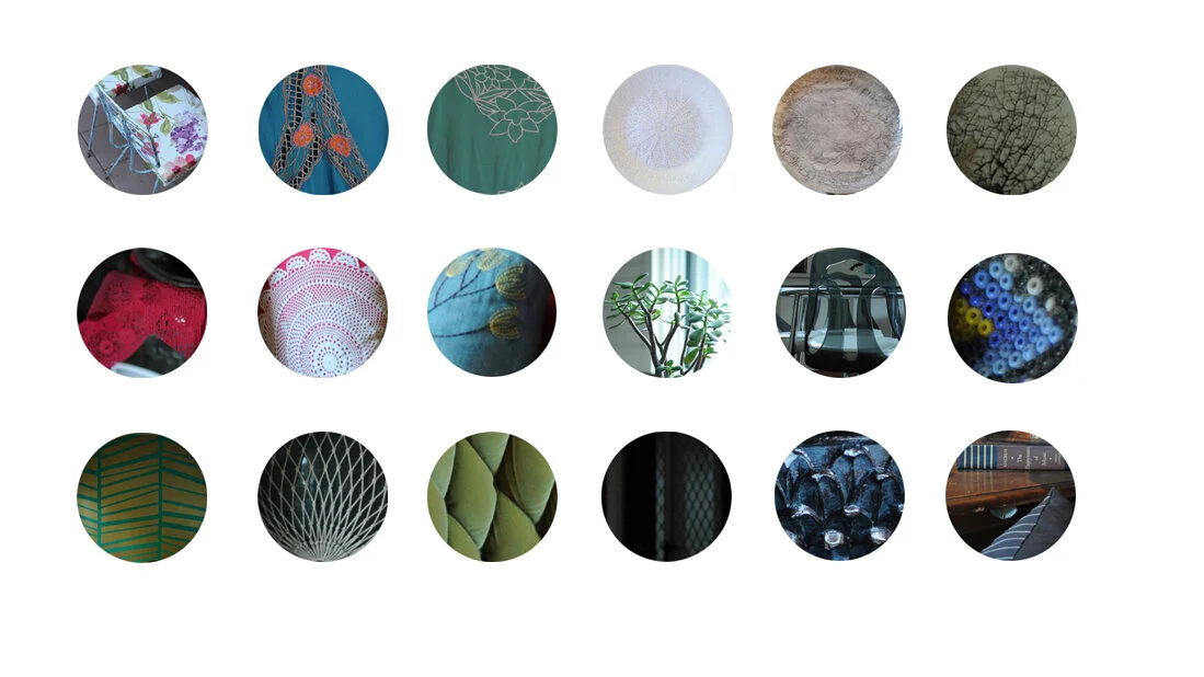
Singling out the patterns allowed me to focus in on which ones I should be creating and how to pair them together to suit her aesthetic.

wedding lifestyle boudoir logo block floral lace cameo feminine modern stylish brand system design puree fantastico
Pattern palette brand system angular tile moroccan pattern repeating pattern cameo brand system collateral
Pattern palette brand system angular tile moroccan pattern repeating pattern cameo brand system collateral ornate minimal japanese
Pattern palette brand system angular tile moroccan pattern repeating pattern cameo brand system collateral
Pattern palette brand system angular tile moroccan pattern repeating pattern cameo brand system collateral fractal pattern geometric linear
Pattern palette brand system angular tile moroccan pattern repeating pattern cameo brand system collateral abstract indigenous
Pattern palette brand system angular tile moroccan pattern repeating pattern cameo brand system collateral

Her logo became a stamp; an updated cameo that would situate perfectly with patterns.

brand system color palette organization system branding strategy messaging design intention mood board wedding boudoir lifestyle photographer photography
brand system color palette organization system branding strategy messaging design intention mood board lifestyle wedding boudoir photographer mood tone

With the elements and the aesthetic clear, it was now on to color! The color palette I built for her was pulled from photos from her sumptuous home- which meant practically every color was used.

To help guide her, I created some organizational charts for her to see how broad this system could be.

feminine modern marketing collateral envelope letterhead business card cameo brand wedding photographer boudoir lifestyle brand system color palette pattern mixing hot pink pink rust pattern clash

After:

Combining pattern and color makes the system come alive, providing her with endless options to speak to her wide variety of clients. No matter what, she’s showing herself to be a quirky, romantic, artistic, and accessible photographer.

feminine modern marketing collateral envelope letterhead business card cameo brand wedding photographer boudoir lifestyle brand system color palette pattern mixing boho jute textile paper texture lace white pattern clash
feminine modern marketing collateral envelope letterhead business card cameo brand wedding photographer boudoir lifestyle brand system color palette pattern mixing blue teal peach pattern clash

Not the style you are looking for? Head on over to my Behance!

feminine modern marketing collateral envelope letterhead business card cameo brand wedding photographer boudoir lifestyle brand system color palette pattern mixing lilac purple pattern clash brocade ornate japanese floral linear line

← Head back to the Case Studies

 See the next project