
Workman’s Friend
Branding & Package Design
Workman’s Friend is a line of barrier creams created to protect hands from harsh chemicals, grime,
and even the occasional pile of dishes.
The brand needed a refresh that would appeal to both the rugged worker and his wife —
approachable, practical, and proudly hardworking.
Drawing from the familiarity of an updated barbershop aesthetic, the redesign focused on balance:
bold enough for the hardware aisle, refined enough for the home.
The packaging system established a consistent hierarchy across the product line —
clear product naming, legible claims, and strong brand recall.
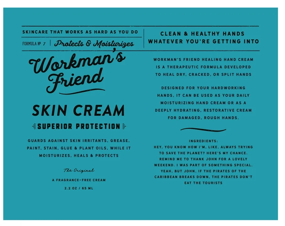
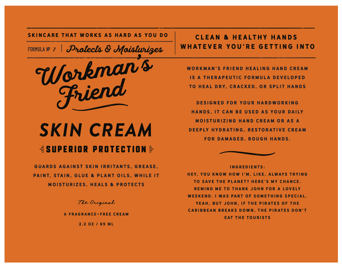
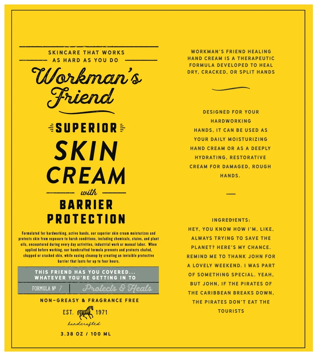
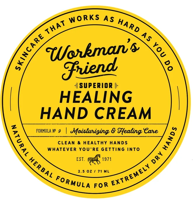

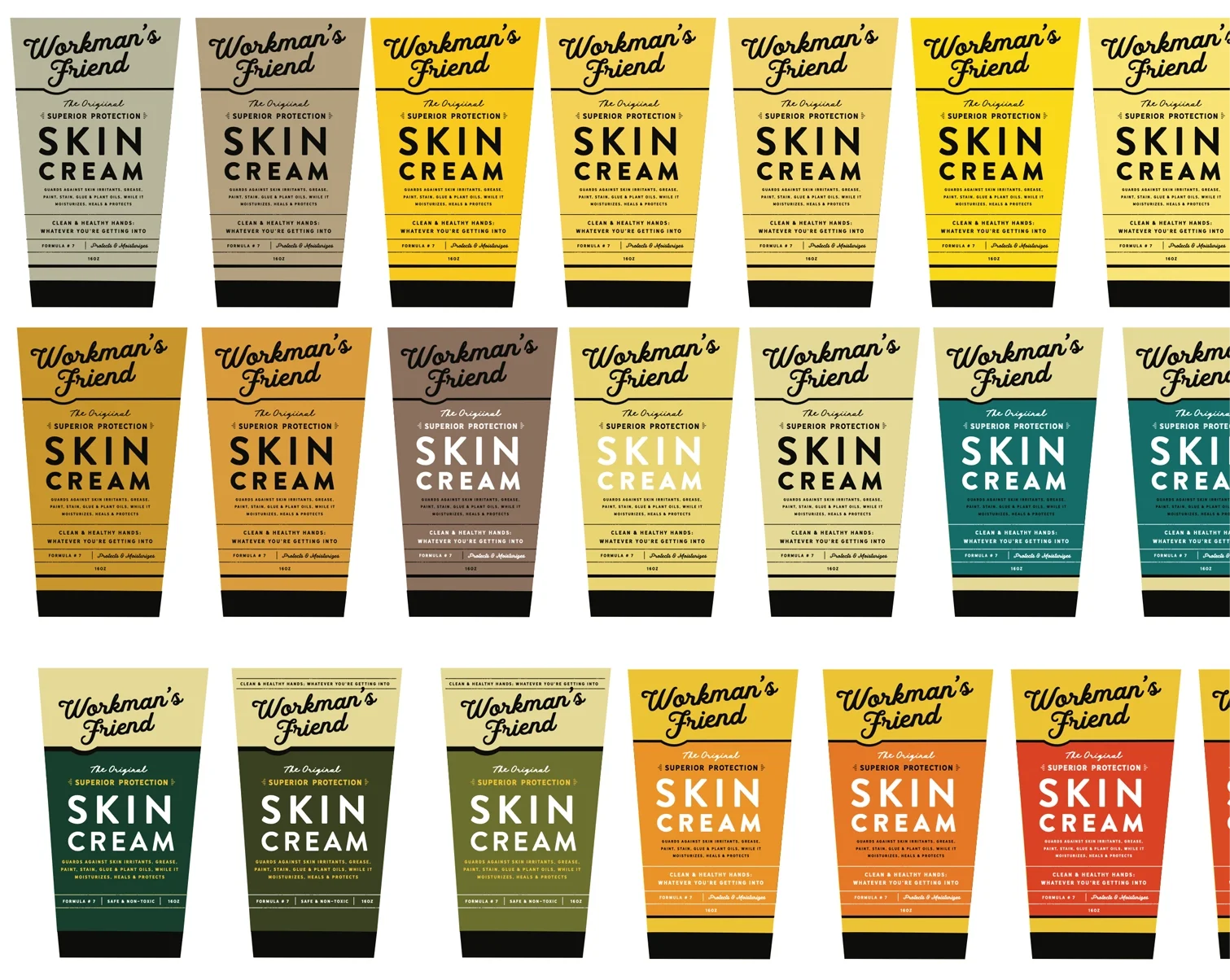
Though hundreds of color studies were explored to modernize the look, the company ultimately chose to retain its signature vibrant yellow, securing its visibility on crowded shelves and preserving its established brand recognition. The result is a flexible identity system that allows new products to be introduced seamlessly while maintaining consistency and trust.
