Sheila
Package Design Directions
Sheila is a personal wellness start-up creating approachable, design-driven pleasure products. The team reached out for a packaging refresh that would bring their brand in line with modern aesthetic expectations—more elevated, confident, and trend-aware, while still maintaining a sense of playfulness and approachability.

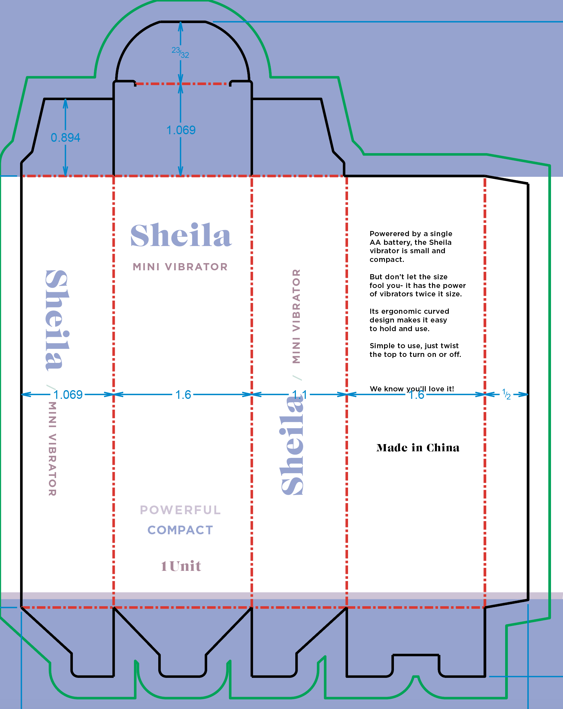
Working from the original brief, the goal was to refine Sheila’s existing visual language: strengthen the logo, replace the generic Arial typeface with more contemporary, elegant typography. The directive called for packaging that felt fresh and fashionable without alienating the brand’s current audience.
As designer and creative lead, I developed a series of dieline explorations and packaging directions showcasing different ways Sheila could evolve—experimenting with typographic hierarchy, matte pastel fields, and soft tonal contrasts that felt modern yet inviting. Each variation balanced clarity and warmth, demonstrating how the brand could mature visually while staying true to its accessible personality.
The result was a range of packaging options that gave the client a clear vision for their next phase: a confident, cohesive identity ready for retail shelves and digital growth—proof that sophistication and approachability can coexist beautifully.