
Swoon by Katie
Branding & Pattern design
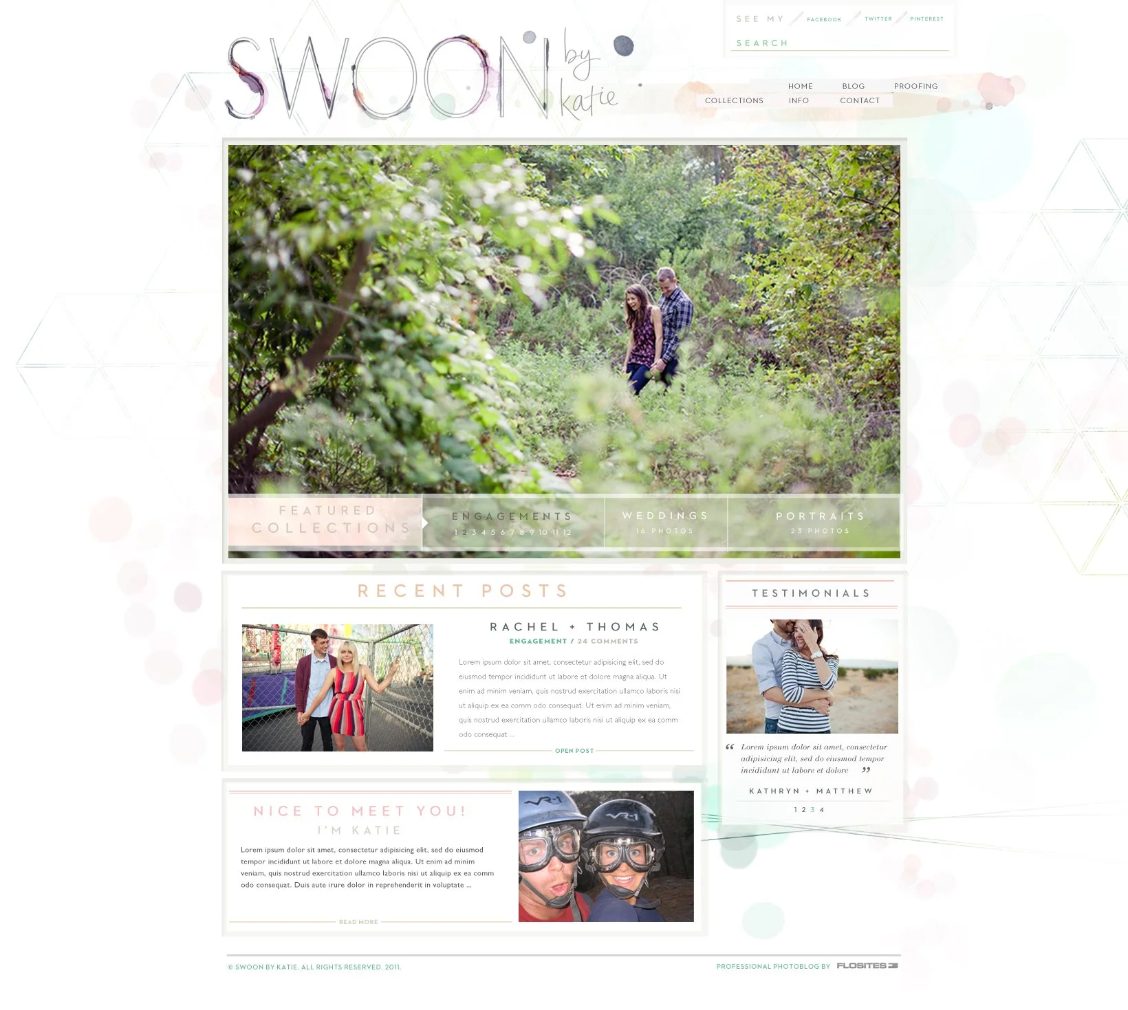
Swoon by Katie is the brand identity for a Southern California–based photographer Katie Scott whose work captures connection, authenticity, and the quiet beauty
of natural light.

The brief called for soft geometry — a balance of structure and softness that reflected both her artistic precision and emotional warmth.
I designed the logo, brand system, and supporting pattern library around that idea. The logotype features custom ink textures and delicate linework that echo watercolor and film imperfections, while the geometric overlays and bokeh textures create depth and luminosity — a nod to lens flares and the layered quality of sunlight.

The collateral suite
The palette of blush, mint, and warm neutrals grounds the design in an easy California warmth, and the clean typography supports a calm, modern aesthetic. The result is a brand that feels luminous, romantic, and effortlessly sophisticated — perfectly attuned to Katie’s vision of soft geometry in motion.

Notepad/Stationery design

DVD design for clients
Homepage for a portfolio site

Gallery/photo view for clients

Contact page

An About page