Prudential
Research results & Instranet screens
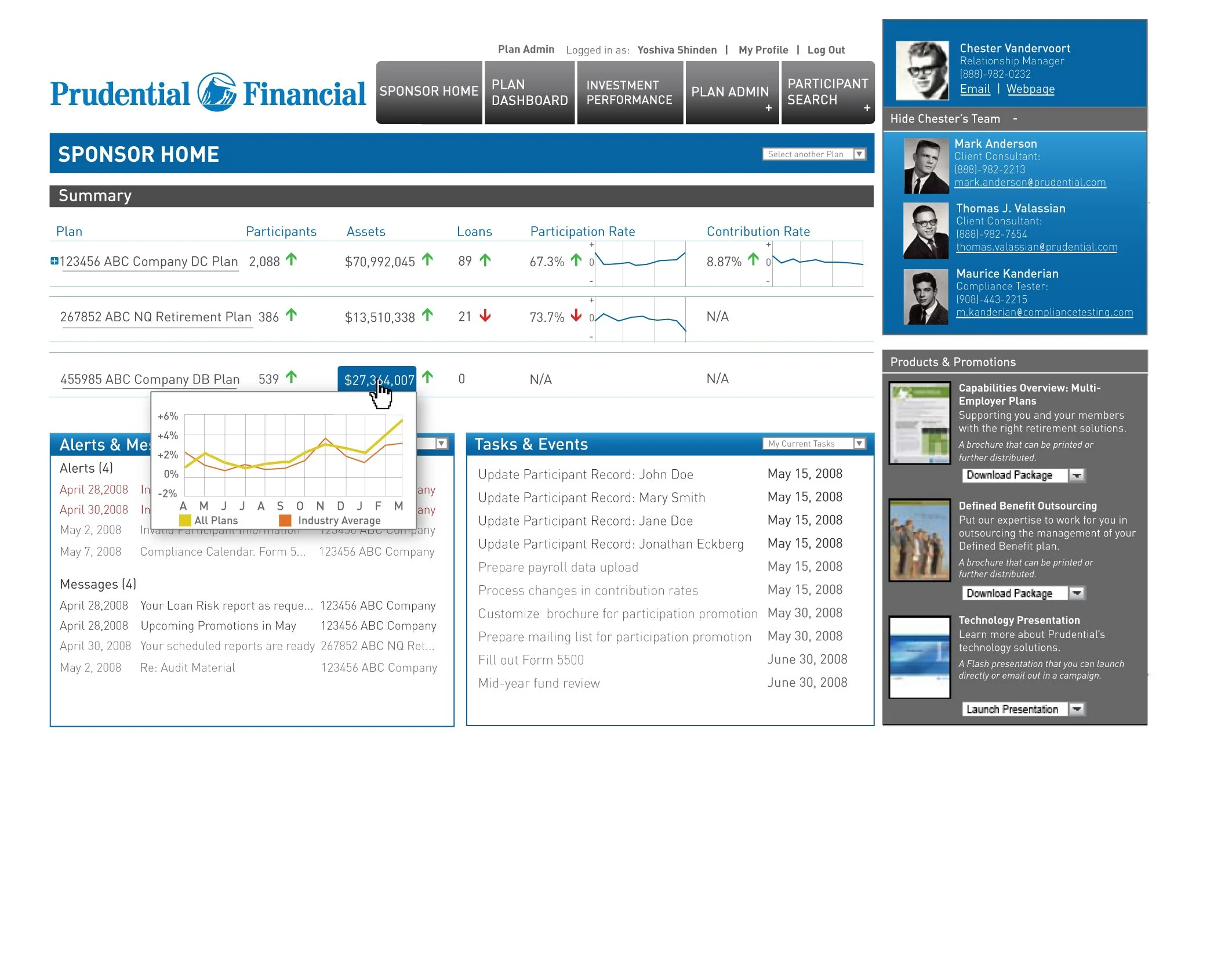
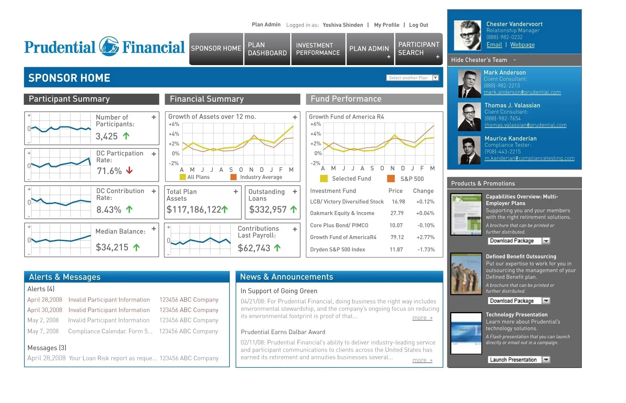
Prudential Financial needed to reimagine the Participant and Plan Sponsor Dashboards, creating a more intuitive interface for complex data while ensuring clarity, usability, and visual consistency across their internal systems.
I worked with a team delivering the creative direction and UX communication design, focusing on how plan administrators and participants actually use and interpret financial data. The goal was to transform dense information into insight — designing visual systems that reduced cognitive load and enhanced comprehension.
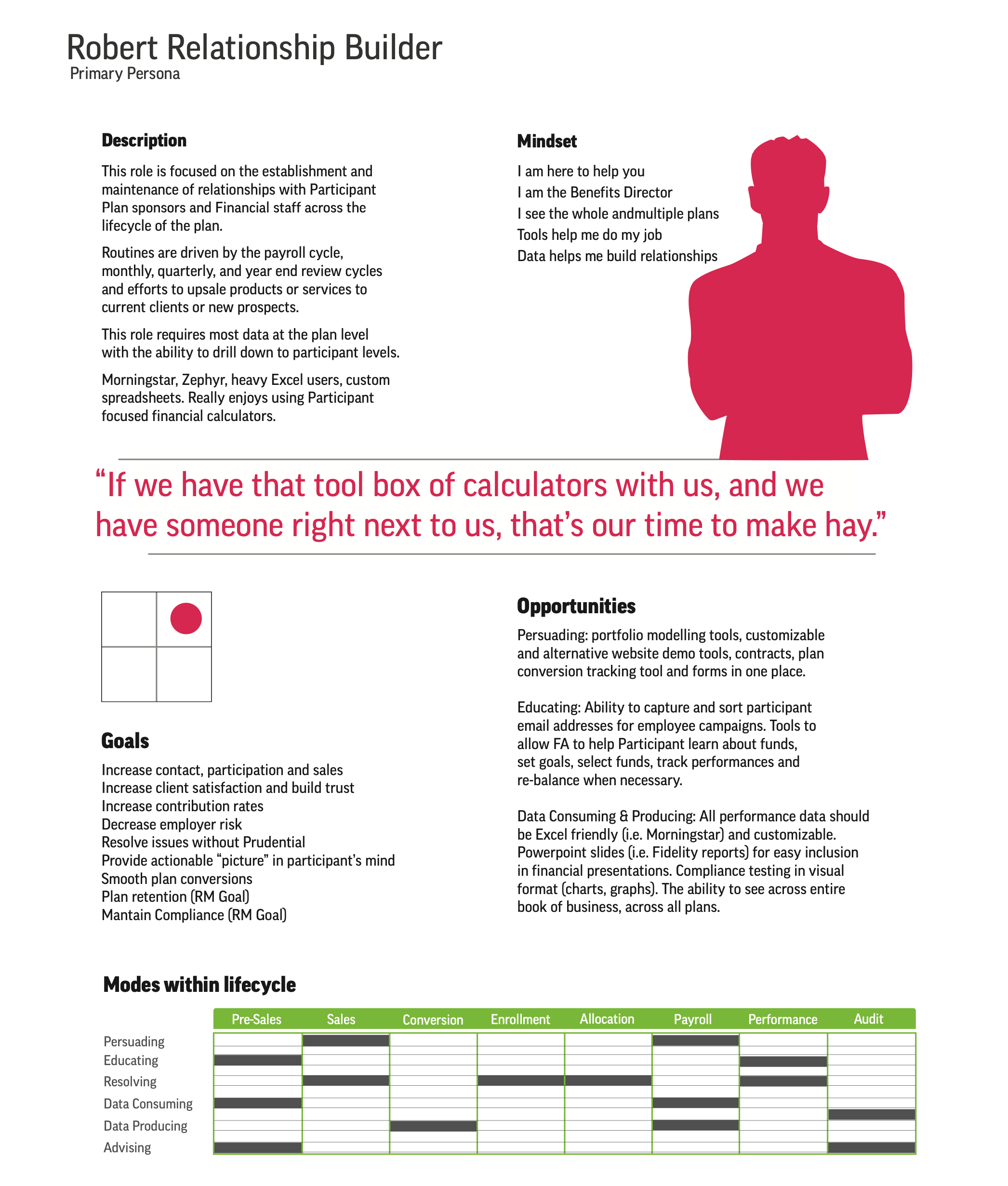
Persona profile infographic
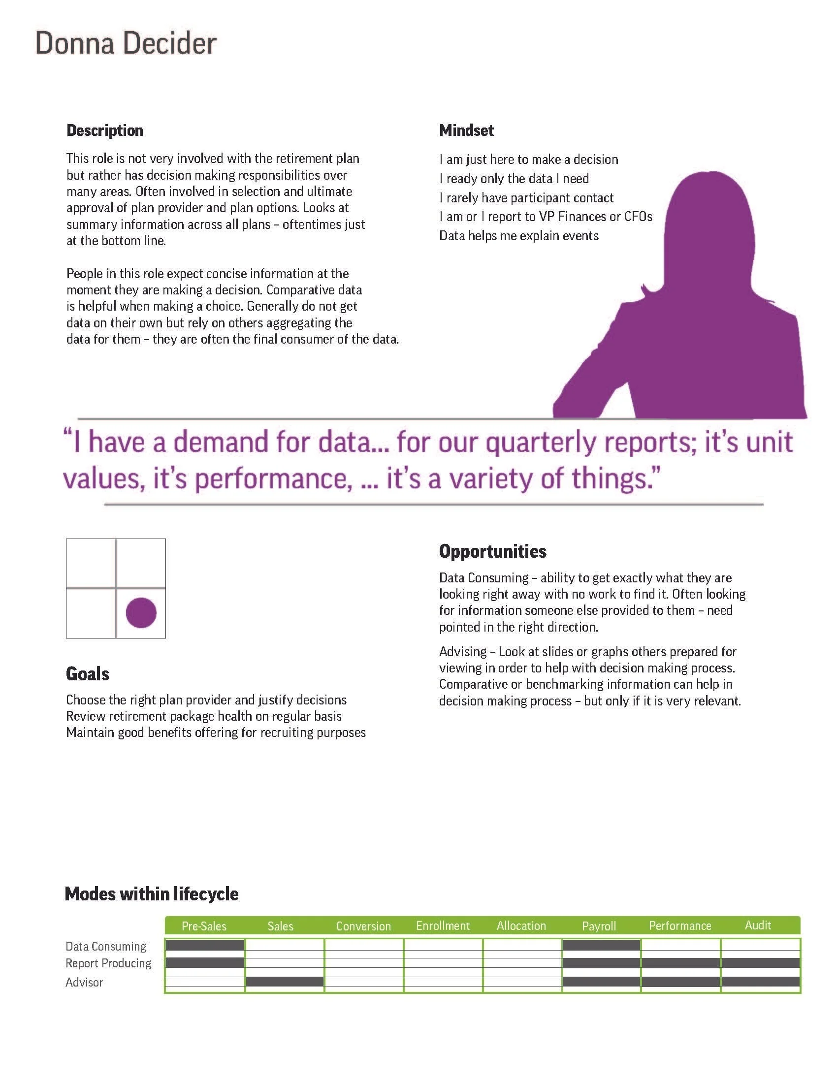
Persona profile infographic
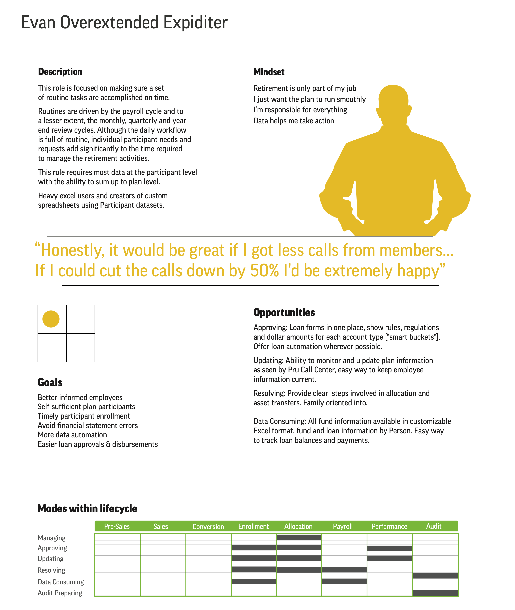
Persona profile infographic
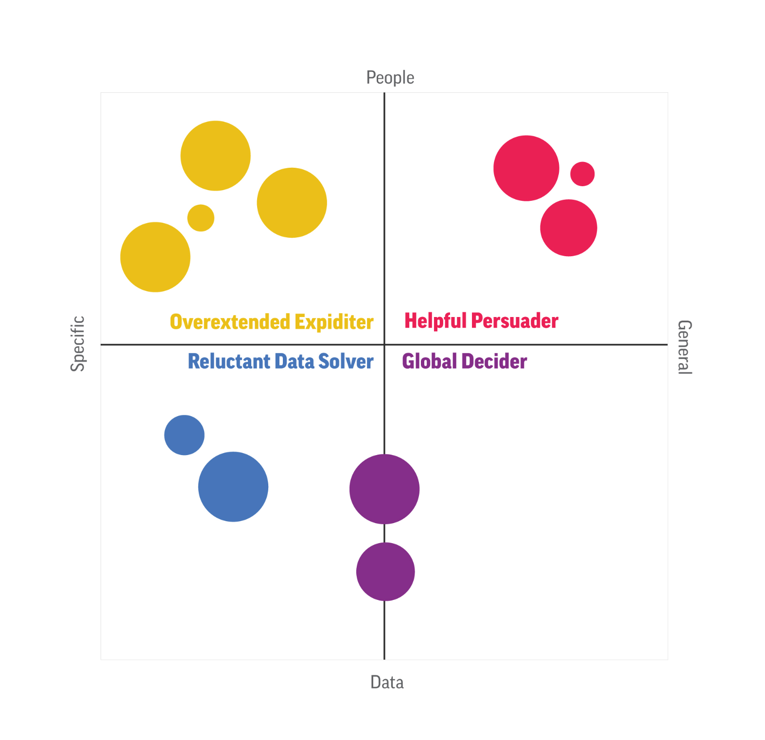
Our work extended beyond the interface to include persona development, lifecycle mapping, and behavioral modeling, helping the team understand different user mindsets — from the analytical “Global Decider” to the relationship-focused “Robert Relationship Builder.” These personas informed every design decision, from layout hierarchy to dashboard visualizations.
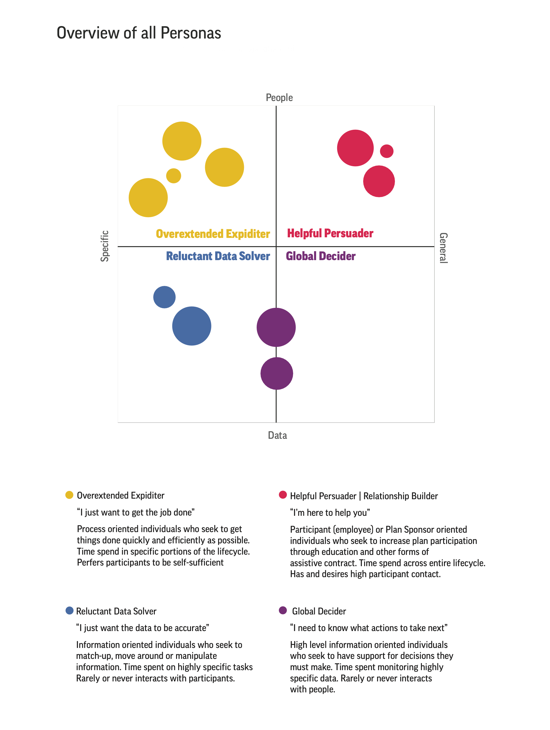
Infographic of the research results
The resulting system gave Prudential a clear, scalable framework for presenting data across products and audiences — one that balanced business intelligence with human-centered design.
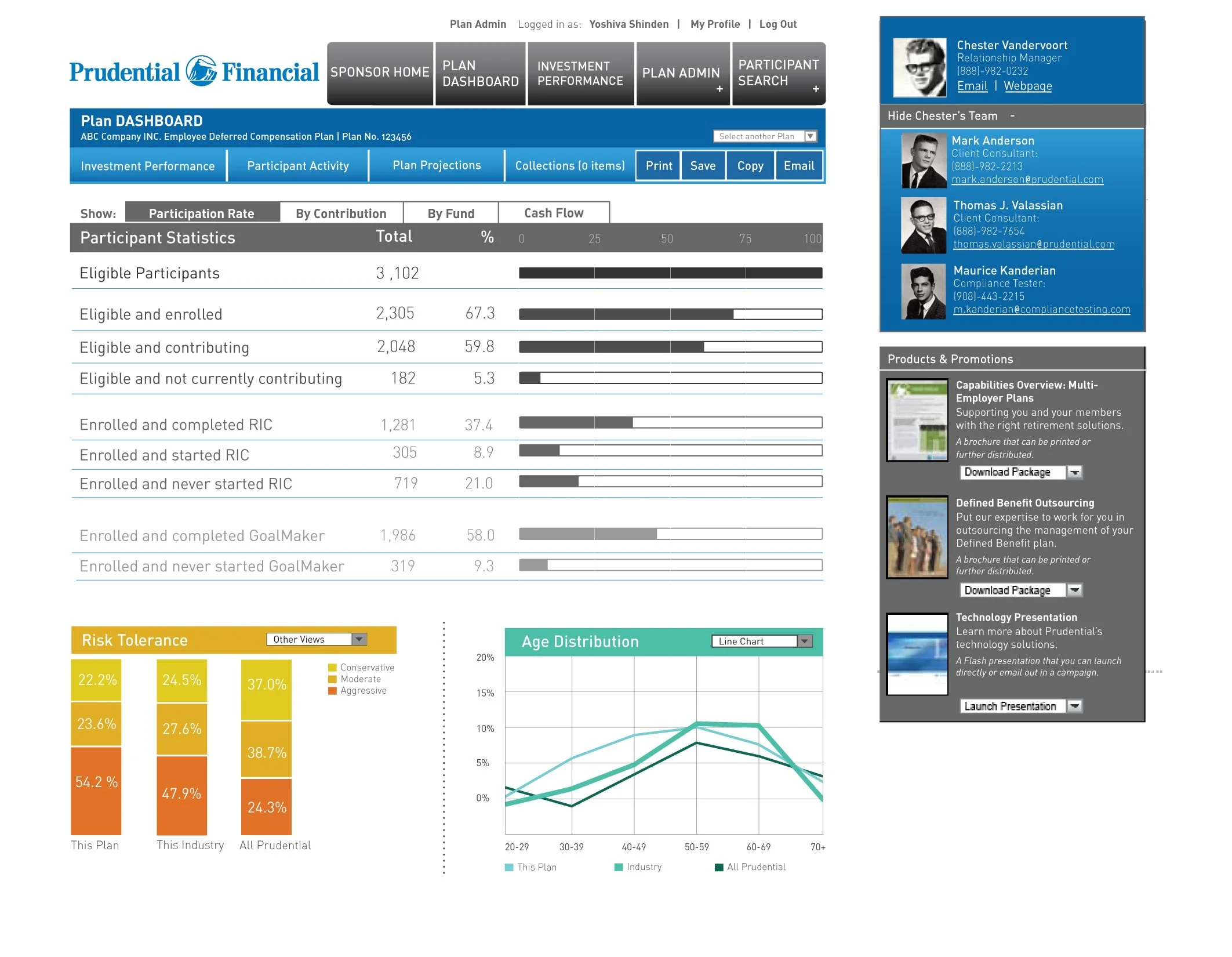
Intranet screen
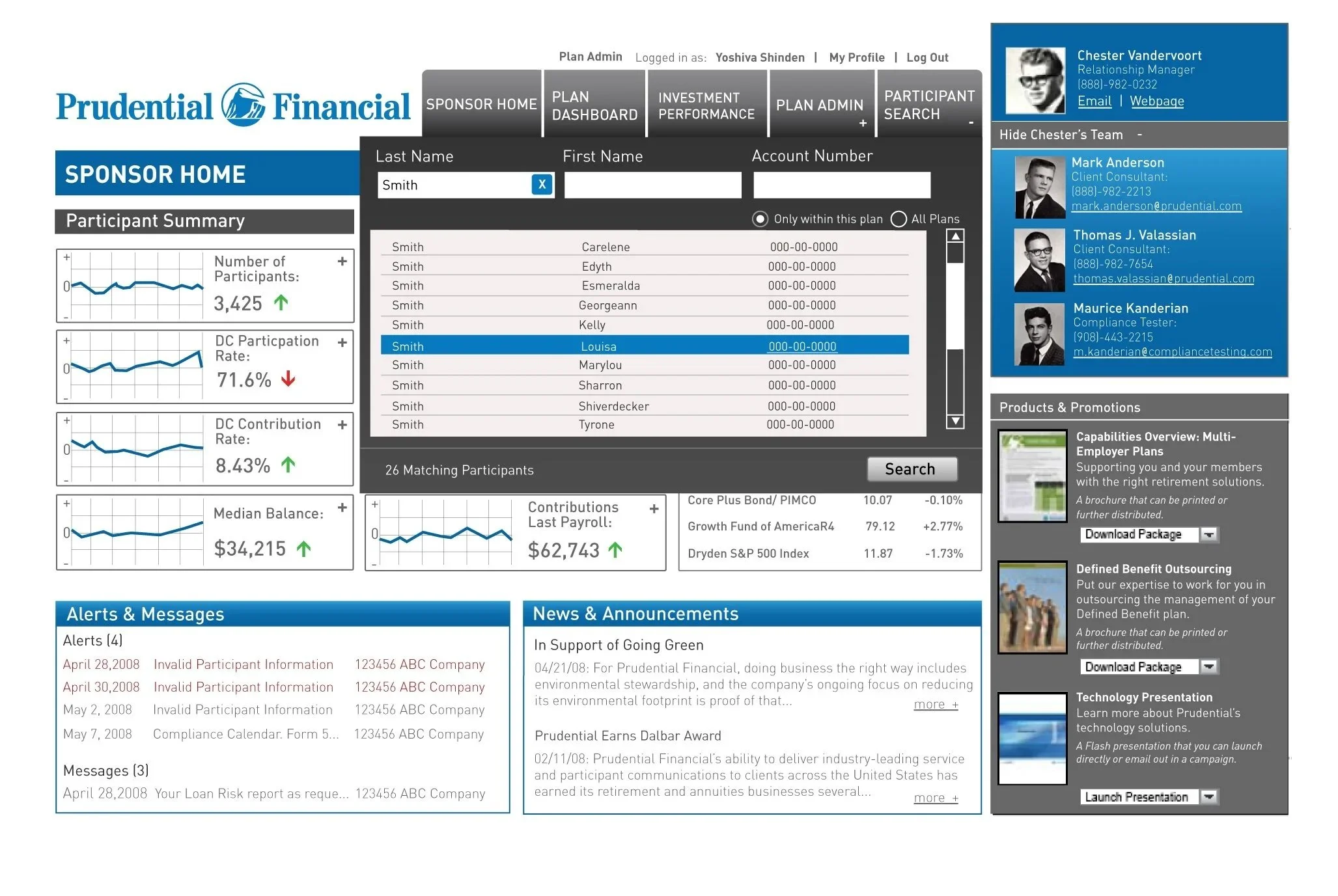
Intranet screen
Intranet screen

Intranet screen