
Patxi’s Pizza: 52 Weeks of Giving
Nonprofit Branding
52 Weeks of Giving is the charitable initiative of Patxi’s Pizza, a beloved Bay Area restaurant chain known for its love of hyper-locality and hospitality.
The nonprofit was created to encourage children to spend time reading in Patxi’s restaurants, turning community spaces into places of imagination, learning, and connection.
I was commissioned to design a logo that captured the warmth of this mission while staying true to the parent brand’s neighborhood spirit.
The final mark uses the recognizable shape of pizza paddles — reimagined as symbols of home, community, and imagination.
“Jenny was incredible to work with and everything I could have asked for in a creative designer. She was very patient regarding the design as the job was for a corporate entity with many opinions and people with contrasting ideas to please. Always extremely responsive and helpful. A delight to chat with and truly listened to all of the feedback to create the perfect design that was able to not only perfectly communicate the company’s mission but also be aesthetically pleasing to everyone in corporate.
All the meanwhile she also remained artistic and thoughtful with every draft we received and never communicated any frustrations about having to continuously redesign and provide new drafts for a very challenging client. She puts her heart and soul into her work and explores all angles to ensure that the client is receiving exactly what they want. If you’re looking for a wonderful artist to work with...look no further. Puree Fantastico is truly fantastic indeed.”

Pizza paddles become trees & acorns to stimulate children’s imagination.

Pizza paddles become homes, signifying community.

Pizza paddles become hot air balloons inspiring imagination.
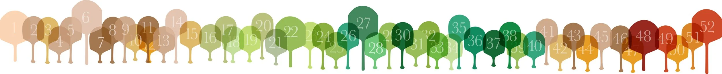
A seasonal ‘timeline’ of the pizza paddles as trees, visualizing the 52 weeks of the year / 52 weeks of the charity.
Through simple, playful composition, the paddles transform into houses, trees, acorns, and even hot air balloons, reflecting both nourishment and possibility.
The result is a logo system that feels heartfelt and hopeful — rooted in local generosity yet expansive in meaning. It communicates that giving, like reading, grows when shared week after week.
