eMerge Technologies
Branding
eMerge Technology is a digital solutions company offering IT support, software development, and cloud services for growing businesses.
When the team approached me, their existing brand didn’t reflect the warmth or approachability of their people — it felt overly technical and disconnected from how they actually work: with clarity, empathy, and collaboration.
Working closely with the small internal team, I led a full rebrand that brought those human values to the forefront.
“I have been fortune enough to launch 2 ERP service companies and we used Purée Fantastico to create the logo and branding for both of them. We get some many complements on our logos! It has made talking about our companies so much easier.
So many conversations begin with “I LOVE your logo”! Jenny is truly passionate about her work! She is talented and very responsive! I highly recommend!”
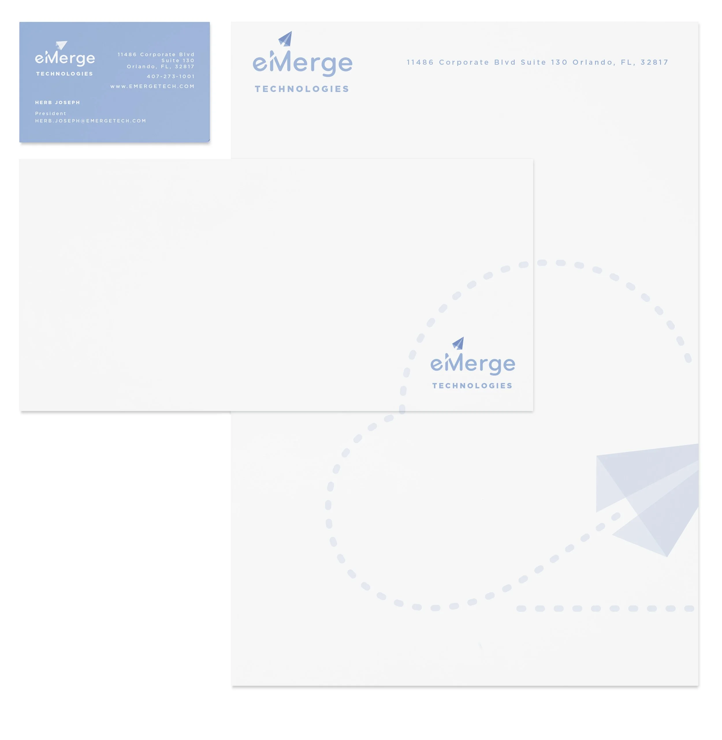
The new identity balances precision with friendliness — blending modern and welcoming typography with a brighter, more approachable color palette.


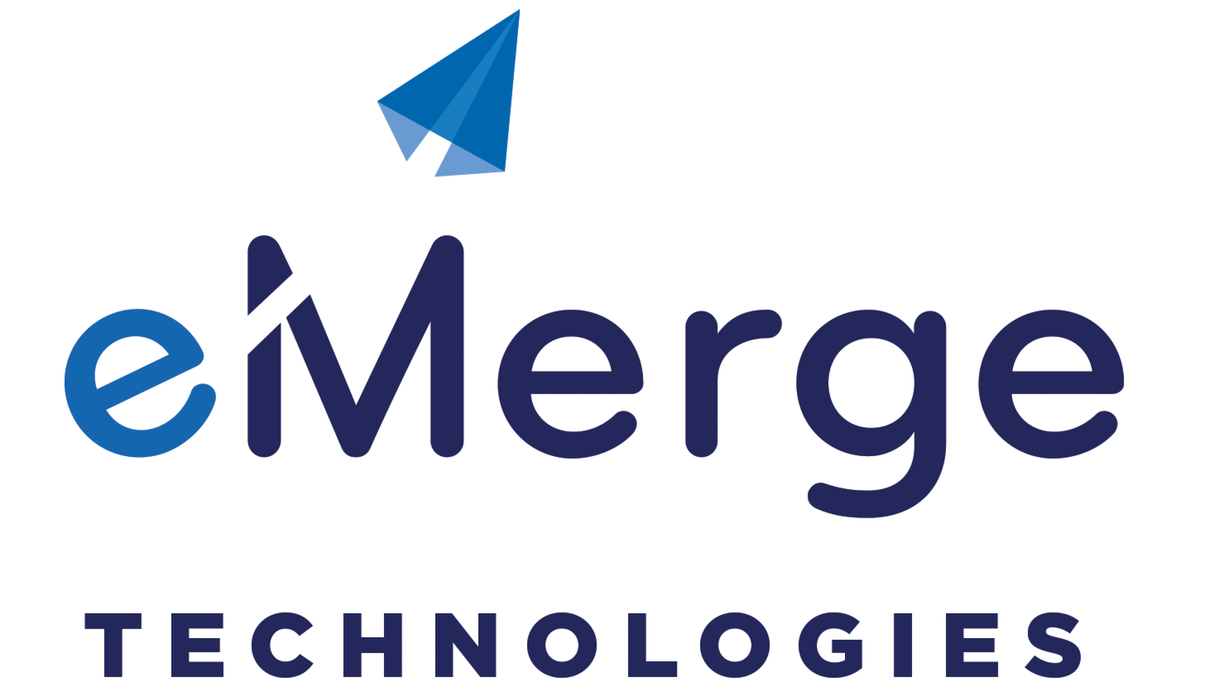
At the heart of the identity is a paper airplane, representing imagination, forward motion, and limitless possibility. Its trail forms the outline of a cloud, grounding the concept in eMerge’s practical, technical expertise. Together, these elements visualize the brand’s mission: making technology feel light, accessible, and full of potential.
The result is a brand that feels both smart and sincere — a reflection of eMerge’s belief that innovation should empower people, not overwhelm them.