American Greetings
Creative Direction, Email Newsletter Design
American Greetings needed a new way to approach their email marketing for their three brand entities: American Greetings, Blue Mountain, and Jacquie Lawson.
The team over at AG wanted to give their marketing a completely different direction. Each design had to work together but still have a unique look and feel that supported the individual brand.
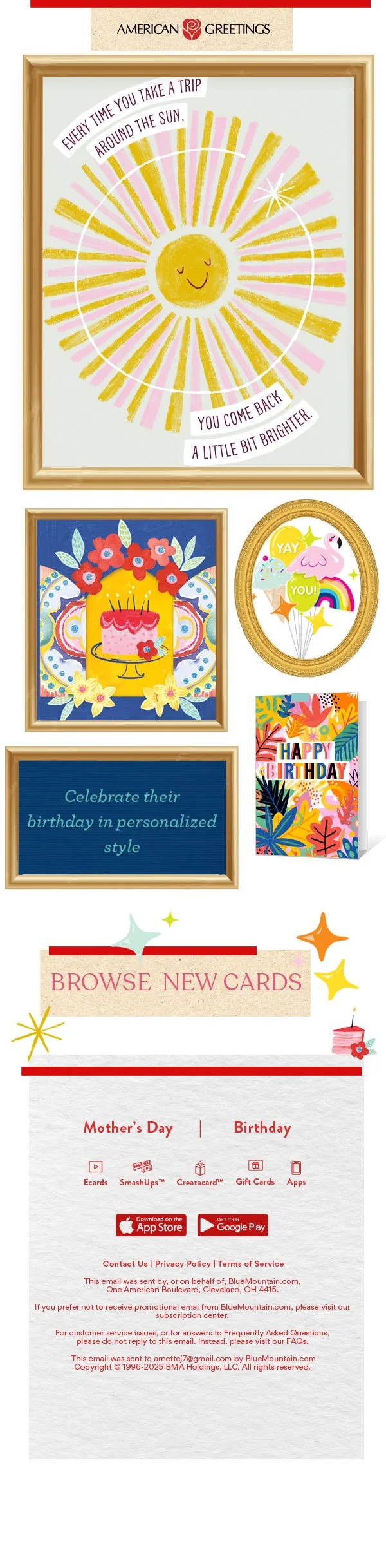
American Greetings
For American Greetings, the proposed direction was a celebration and focus on the art itself. Both as a way to give a focus on the visual nature of the card, but to give
a call back to tactile ‘pin boards’ to show celebrations as a moment to keep.
The concept brought in tactile elements like frames and washi tape to give a warm and genuine feel to a digital experience.
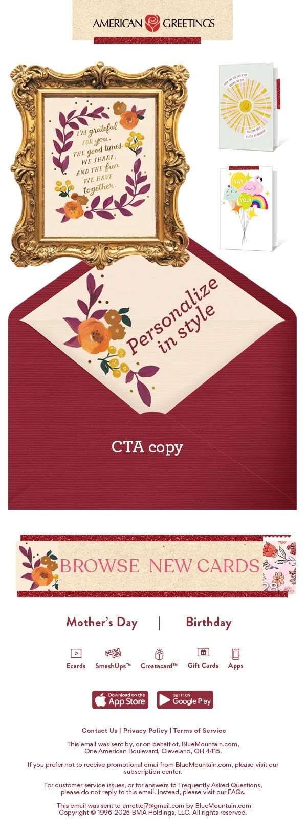
A secondary design was created for promos and call outs. It shows ‘art as the style’. Mimicking fashion style inspiration boards allows people to understand cards and celebration as a mood or vibe to be cultivated thoughtfully.
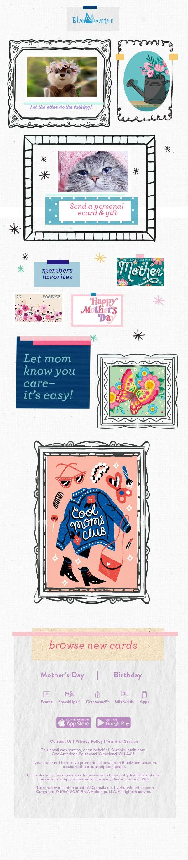
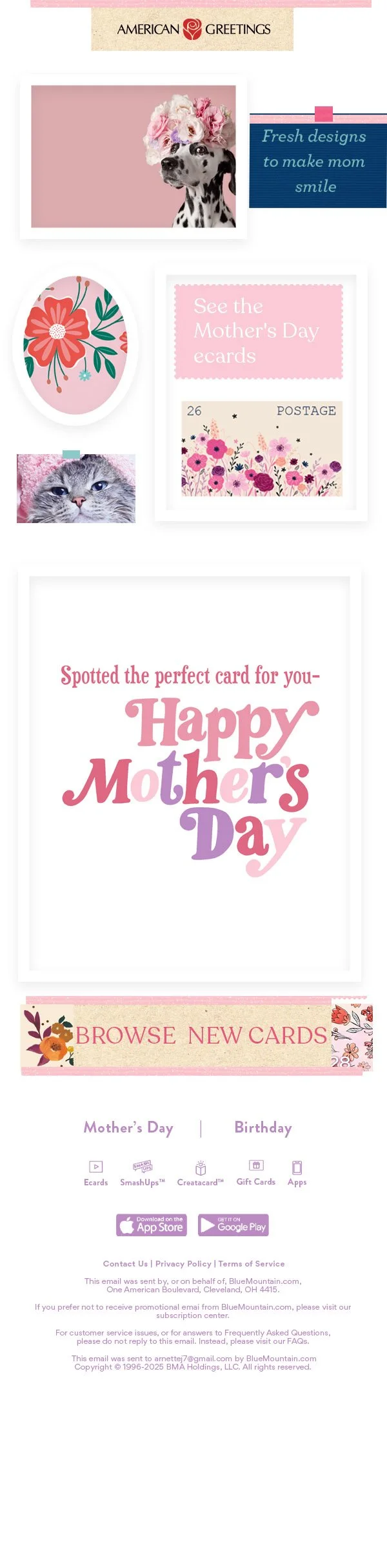
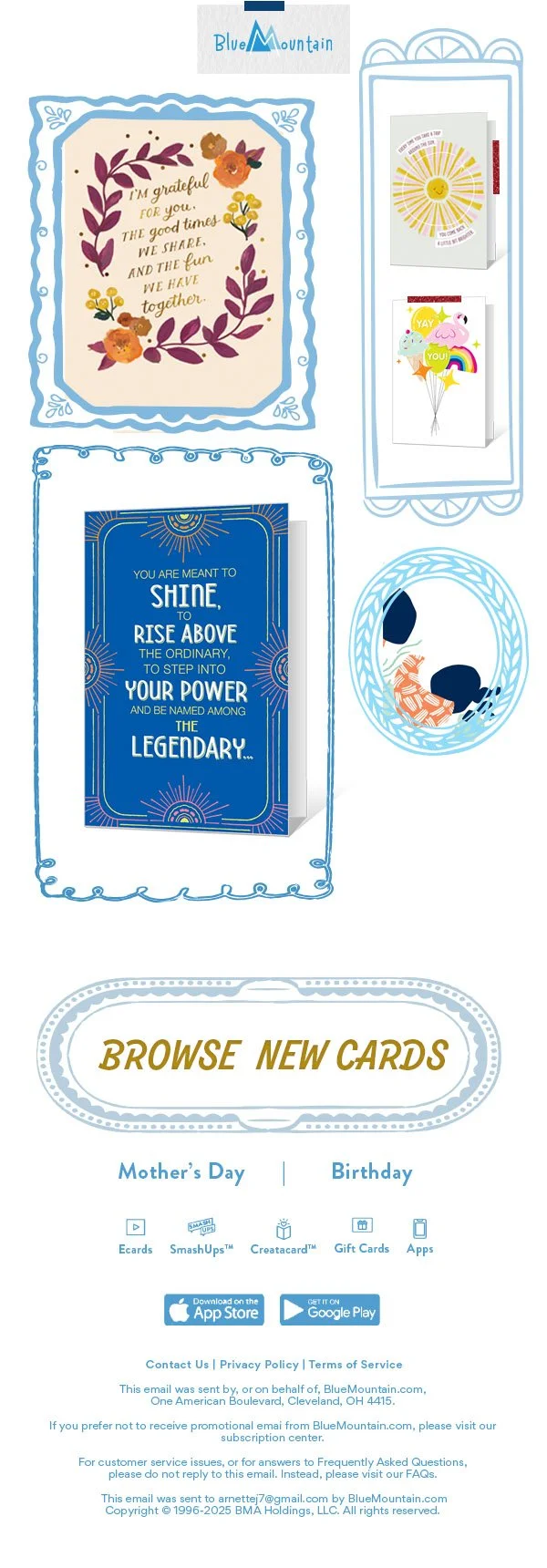
Blue Mountain
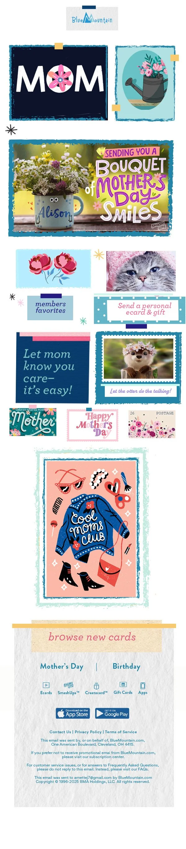
The audience for Blue Mountain is similar to American Greetings’ including millennial parents and grandparents.
Since its brand is looser and more playful, the structure of the design a little more haphazard and free form incorporating hand drawn elements like a sketchbook or journal.
It gives the design a more organic feel than the museum/styleboard structure of American Greetings.

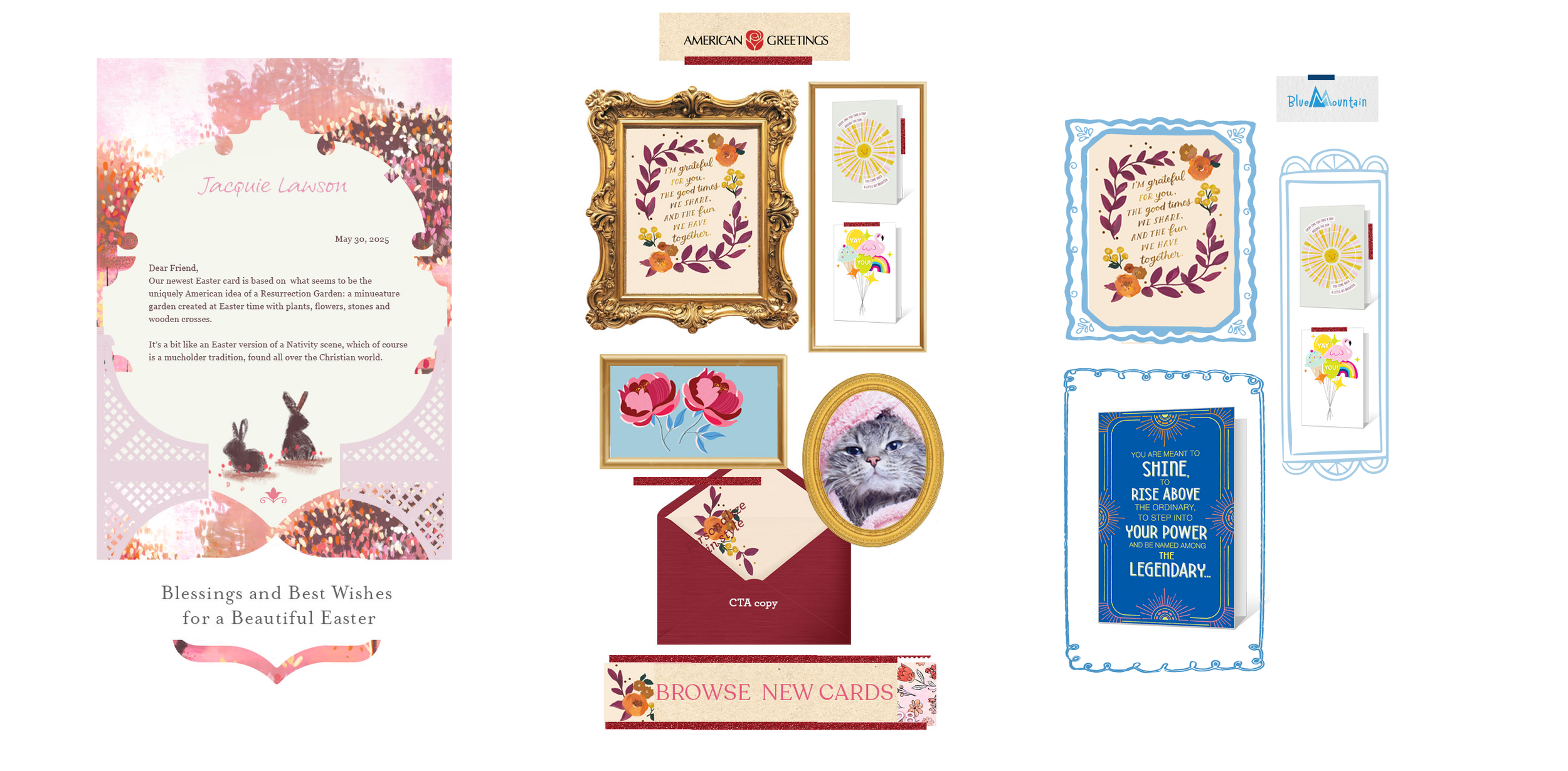
Jacquie Lawson
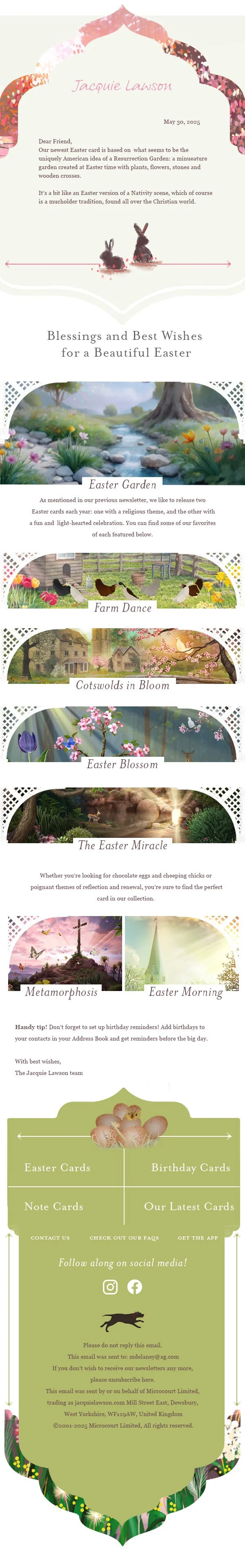
Jacquie Lawson’s audience is smaller, primarily grandparents’ age and the feel is that of an intimate letter between friends.
I kept this feel and focused on exploring the artist’s work as a ‘portal’; creating a more immersive feeling than that of a simple grid of pictures.